Signage for Memory Care providers
Signage for Memory Care providers
What makes the perfect sign for people needing memory care?
Research into the best strategy to help people with memory care needs is ongoing; in some areas opinion varies on the perfect approach to signage in specialist care homes.
We are guided by leading academics and our experience of helping many homes through the Care Quality Commission signage inspection process.
Our approach is built around the following key ideas.
Simple typefaces
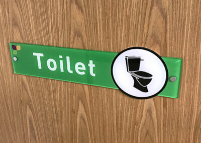
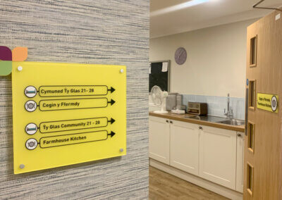
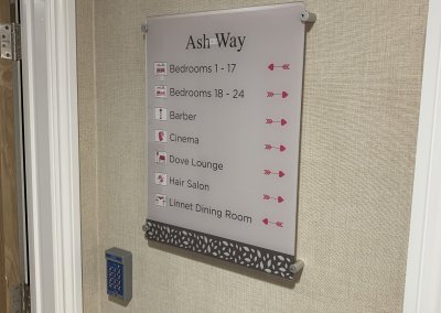
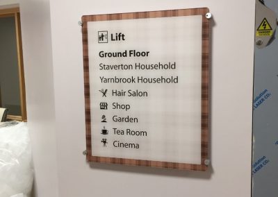
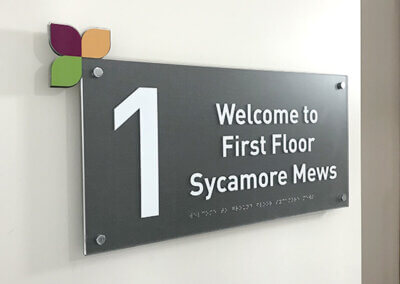
As designers, you can imagine that we have a fondness for exotic typography but that’s not the way to go for signage in a dementia suite. Simplicity is the key.
Memorable images
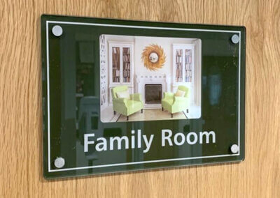
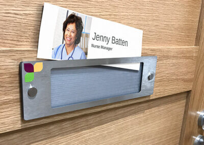
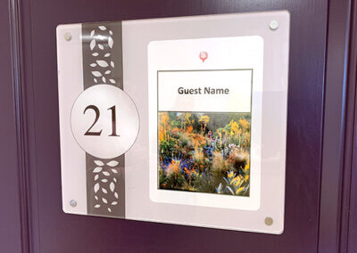
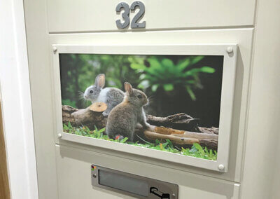
When reading skills are impaired a picture or icon can be used to support or replace text. Many of our solutions include easily replaced panels to allow signs to be tailored to resident’s preferences. Images providing strong visual cues can include;
- Their favourite pastime.
- Memorable times, places or people
- Their name
- Their room itself
Frequency
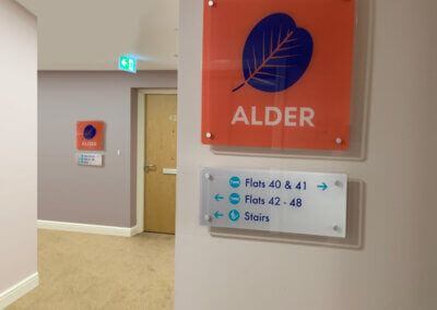
Anyone can overlook a single instance of a sign but when the message is repeated in well chosen locations it becomes easier to find the directions required. By adding repeater signs at carefully selected locations along a route it’s possible to build resident’s confidence and independence.
Complete Route signage
For people with memory difficulties it’s not always easy to reverse a route just taken. We ensure that the way back is as well documented as the path to a key location.
Taylor & Pickles are approved suppliers of dementia signage for leading care providers.



“Simple, clear and relevant signing can often make significant improvements to the legibility of an environment.”
University of Stirling research


